Category: Applications Development & Support (page 1 of 6)

Reserve group study rooms with the Ohio State mobile app

Undergraduate Student Government (USG) and OCIO student focus groups have validated that the ability to reserve rooms in Libraries buildings is a valued service and should be made available through the Ohio State app. The Web and Mobile team in OCIO and Application Development & Operations in the Libraries have been collaborating to meet this need by developing a linkage between the Libraries’ Room Reservation System and the mobile app. On August 10, the Ohio State app will enable a feature for reserving group study rooms in Thompson Library, 18th Avenue Library (not including Research Commons), and Biological Sciences/Pharmacy Library. Please direct students to the app to reserve rooms in those buildings. (Instructions: https://library.osu.edu/portal/confluence/display/IH/Reserving+study+rooms+with+the+Ohio+State+app)

AD&O would like to express appreciation to Lila Andersen, the Room Reservation System product owner; Sue Beck, project manager; Chris Bartos, the lead developer on this project; and the OCIO Web and Mobile team.

Updates for February 20, 2020: Library Catalog Banner & Footer Refresh

To improve consistency between various library applications, a new look for the library catalog will be put into production as part of the February 20th Maintenance window. Our Applications Development & Support team has updated the look and feel of the library catalog’s banner at the top, and footer at the bottom. With the update, when a user clicks through from the library home page to the library catalog, it will be a less jarring experience because of the similar style and color scheme. The library catalog maintains the same functionality, but the experience of using it will be more in line with the Libraries’ branding on other web pages. 

The new banner:

Image of updated design for catalog banner

Updated Design for Library Catalog Banner

The new footer:

Image of Updated Design for Catalog Footer

Updated Design for Library Catalog Footer

The previous banner:

Old Design of Library Catalog Banner

Previous Design for Library Catalog Banner

The previous footer:

Image of Previous Design of Catalog Footer

Previous Design of Library Catalog Footer

Please contact us if you have any questions or concerns.


Is receiving Qualtrics email notifications important to you?

After hearing from a colleague about inconsistencies she had experienced with not getting Qualtrics’ email notifications, I started investigating this issue. I looked through a huge number of Qualtrics knowledge base articles (XM Support), confirming that we were correctly setting up our notifications however couldn’t identify or explain the cause of their failures.

Not finding any concrete answers, I started exploring the XM Community, where other Qualtrics users share tips, tricks, or solutions. I came across an entry that was surprising but also an answer to my struggles with the issue at hand since the inconsistencies were so random and well inconsistent!

“… I’ve run into a few gliches with emails not sent using the email trigger. Qualtrics support last month said the most updated and reliable email trigger is the one set in the Actions Tab…”

I used the Action Email Task and tested the submission notification and it worked beautifully. After my test results supporting the functionality of the Action feature I switched the form’s notification from Email Trigger to Action Email Task.

So I wanted to share this experience since we all utilize Qualtrics for our various survey, forms, and feedback needs and a breakdown in notifications would impact the services we provide to our colleagues and constituents.

So, please use Email Tasks for your future notifications and update your existing forms and surveys if receiving submission notices are important to you:

AD&S Quarterly Report: Quarter 2, 2019

See what the Applications Development & Support gang has been up to for the past few months in our report for the second quarter of 2019.

Please take a look and let us know if you have any questions or suggestions!

UX Cohort Event: Integrating UX into Libraries IT

The next UX Cohort event explores how Libraries IT is working to become more user-focused.

Description: So you want to improve a system?!? Come and hear how OSU Library IT has been integrating UX work into ongoing sprints. Michelle Henley and Beth Snapp will provide an overview of system improvements and how UX work is folded into regular workflows.

  • Date: Thursday, April 25
  • Time: 2:00 pm – 3:00 pm
  • Location: Thompson Rooms 150A/B

Link to watch remoteley: http://carmenconnect.osu.edu/integratingux/

Please join us!

TO JOIN THE UX COHORT MAILING LIST: To join our mailing list for updates on meetings and user testing, send a message from your OSU email account to libuxcohort-join@osu.eduand then reply to the automated confirmation message. Once enrolled, you will be able to send and receive messages to libuxcohort@lists.osu.edu as we continue to build our user experience community.

Discover Iterative Improvements for Tuesday, March 19

Please take note of the improvements coming to Discover during the Libraies’ IT maintenance window on the evening of Tuesday, March 19.

We have always known that it was important to clue users in to what type of results were displaying in each bento. The option to hover over the question mark graphic next to each label and view a description has been available. However, usability testing consistently demonstrated that users didn’t see the question mark as a call to action to hover over for them to get more information. In order to reduce cognitive load and clear up the confusion about what section would offer them the most appropriate results, we instead added a brief explainer next to each label.  

Explainers add to each bento

Red boxes added in screenshot for emphasis.

Another issue that bubbled to the surface from usability testing was in our Digital Collection bento. The default image icon being used when a thumbnail wasn’t available was seen by users as a clue that viewing that result would lead to an image, such as photo. But often, because the result would point users to a pdf of a document, the default icon when there is not thumbnail to display is now a pdf document icon:

Red box added in screenshot for emphasis.

The Applications Development and Support team continue to make improvements to the Articles+ segment.  The bento view results in Articles+ are currently arranged as scrolling tiles arranged horizontally.  While this works well for the Digital Collections segment, it didn’t work as effectively for this more text-heavy segment. 

Before: Horizontal scrolling

The new design will revert to a simplified vertical list view, showing three results, with a prompt to view more. 

After: Vertical List

To avoid confusion, the bento view is now also limited to peer-reviewed and full text results, just as it is in the focus view.  (See the 2/21 blog post on Discover improvements for more information about this.)    

And finally, to improve accessibility, we have improved the limiters that were displaying results in all lower-case text. Now, the capitalized results are easier to skim.  

Discover Iterative Improvements for Thursday, 2/21

Further improvements to Discover will be applied during Libraries’ IT maintenance window on the evening of Thursday, February 21. 

Some of the improvements occur behind the scenes, but because of them, you should notice a reduced loading time of page results.  Another update by the Applications Development and Support team adds more discoverable content via the Library Web Search. Now you can find information about digital exhibits, the Research Commons website, and blogs within the library.osu.edu umbrella. 

The Articles+ section of Discover will improve in two significant ways. Based on usability testing with doctoral students and other feedback we received from multiple channels, users will first get resuts that are categorized as peer-reviewed, and also available in full text (owned by OSU). The results will be indicated by the two options automatically checked in the Focus view:


A mockup of the updated Focus view.

A mockup of the updated Focus view.

Unchecking either of the two options will change the number of results, offering more options that can be requested via Interlibrary Loan. As always, we are open to feedback, and look forward to your comments. 

Discovery Beta Refresh

Digital Initiatives and AD&S have been actively working hard on the discovery project as we work towards January 1st, 2019 as the target date to take the software out of beta.  We are excited about the progress being made and the plan that will take us into the new year. With this most recent update, you’ll see some exciting new concepts as well as the integration of a good deal of backend development designed to make the tool faster, easier to manage, and more consistent.

But first, Terry would like to thank some people for their continued hard work on the project… 

Stephen, our lead developer, has taken it upon himself to learn a variety of new skills and tools to really push the direction of this project.  Early on, we challenged him to find a better technical model that what was currently available – something that would be easy for us to manage and potentially easy for us to share.  And he’s delivered…incorporating modern web development techniques to develop a light-weight tool made for today’s internet and devices. 

We’d also like to highlight the UX partnership between AD&S and Digital Initiatives.  When we started the discovery project, we wanted to model a different type of development – one that put users at the center.  And this has at times been a challenge for the Libraries.  As we all know, it can be difficult to get a good representative sample when working with such a large population – so we had to look for partners.  Early this summer, we proactively reached out to the OSU student government, and they have been working in partnership with the Libraries to identify and provide students for testing.  It has been a fantastic partnership, and one that is giving us a much larger community to draw feedback.

Michelle has been regularly interviewing and working with our user community to understand some of the pain points in the new discovery tool.  In general, the feedback has fallen into a handful of specific categories:

  1. Confusion around the interface – while we have tried to reduce the reliance on library jargon (like facet), the many bentos, the scope of content…these are proving to be barriers. The many bentos are giving a lot of context, but ultimately, one of the challenges for students is a lack of understanding as to how we organize collections in the Libraries.
  2. Inconsistent links – we’ve been having some troubles with some interactions with the proxy and content returned via EDS. This hasn’t been completely resolved, but it should be soon.  However, this has lead us to over compensate on the interface by putting links everywhere.  Students are asking that when we link something (like an article title), that the results are consistent and reliable. To that end, we have reduced some unnecessary data and linking options.
  3. Simplifying Workflows – the process of getting to help or items is still taking too many clicks. We need to find ways to continue reducing the number of decisions made to get to valuable content.
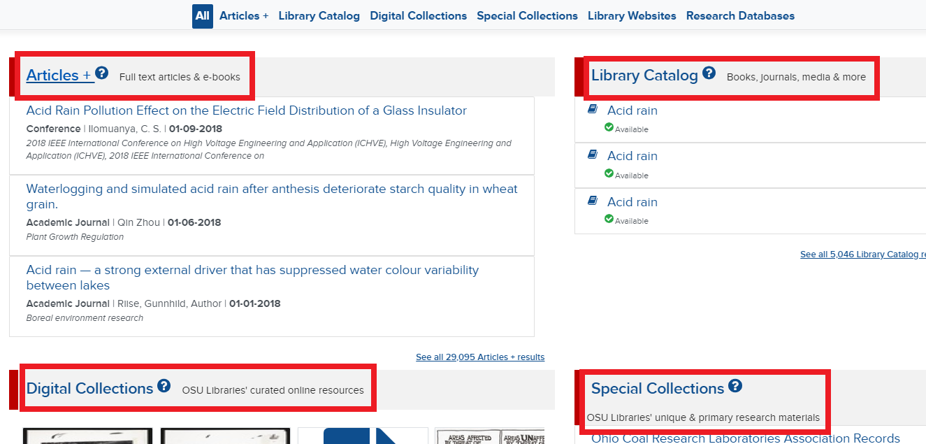
Discovery Refresh

With this in mind, we spent a lot of time working on the back end to fix reliability and refresh issues, to address speed and performance concerns, and to take a hard look at how we present content to the Libraries.  So, with this refresh, you will  notice a few new things.  First, there is a new “view”.  While the default view continues to be bentos broken out by category, we have introduced a more integrated list view as a new option for Discovery. 

Discovery Refresh

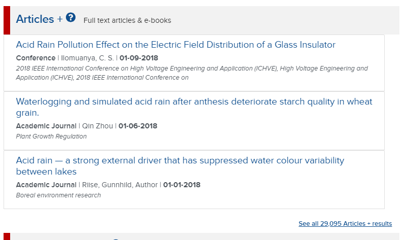
This view has just the Articles+ and the All Library Content.  Users can toggle to this view by clicking the list icon in the upper left  of the application, and allows us to put all the content in the Libraries in context against the user’s search.  This option is provided specifically to address user feedback – to simplify finding content in the Libraries.   For users who still want to focus on a particular type of content,  the focus views continue to be available.  We’ll be performing usability testing this new interface and making a decision around the default view based on extensive feedback.

In addition to the new user interface option, we’ve implemented an updated indexing core and session management.  This will have two important impacts.

  1. It will allow us to develop more granular indexing rules around content types – enabling better discovery.  In our previous model, books shared the same indexing rules as EAD files.  In the new model, these can be different.  That’s enabling us to really push our indexing tooling.
  2. In the current discovery tool, sometimes pages would hang. This was sometimes related to how events (actions) occurred within different browsers.  To fix this, Stephen has implemented a shared session manager that will create a more reliable and faster user experience.

Going Forward

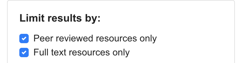
With these changes in place, AD&S and Digital Initiatives will be shifting Discovery development from feature development to quality development.  This means that over the next month, we will be specifically addressing user feedback – targeting pain-points and simplifying workflows.  This will include some new limits in Articles+ like limiting results to OSU owned content and peer reviewed materials, to a more straightforward process for users looking to find e-books or pass a search to OhioLINK.

Finally, if you are interested in providing feedback, Michelle is actively looking for feedback from the Libraries.  In addition to working with students, Michelle has done a number of usability sessions with faculty and staff in the Libraries.  If you want to be a part of that process, or know a student who might be interested, please let her know.

Hydrator: Tweet Downloader

If you ever need to get data from Twitter, and do not want to deal with coding, there is a neat application that you can use: Hydrator, a desktop application that takes in tweet IDs and returns the corresponding data from Twitter as JSON. Hydrator handles the Twitter API rate limits for you, and allows you to pause and continue the downloads if desired. Users have the option to convert the data to a CSV after the downloads are complete.

There’s just one catch: you do have to have tweet IDs to feed into the application. If you’re lucky and looking for a dataset for or from a common source, you may be able to find a set of IDs online. Otherwise, however, the Twitter API will still be your best bet to query and retrieve a large number of IDs.

REDCap vs. Qualtrics

Here at Ohio State, we can select between REDCap and Qualtrics for our survey collection needs. Are there important distinguishing factors to note between the two?

REDCap allows for more granular access rights to be granted for datasets, along with comprehensive logging and audit trails. Changes to data are more easily tracked using these features. Because of these features and on-premises storage location, REDCap is more suited to use with S4 data, and is often more suitable for research project. Qualtrics, on the other hand, offers an intuitive and easy-to-use UI. It’s often best suited for small-scale research projects and surveys.

A simple way to decide would be to decide if some of REDCap’s special functionality is necessary for your project. If not, Qualtrics may just do the job.

Older posts